

32·
1 year agonot entirely on topic, but you might like search-lemmy.com/
Il faut imaginer Camus hébété.

not entirely on topic, but you might like search-lemmy.com/
i’m glad i could be helpful - i realise federated social networks are a bit of a paradigm shift, so feel free to ask me if you have any other questions (although i probably won’t have any answers)
your particular instance (jlai.lu) has defederated from lemmynsfw (though oddly not pornlemmy.com); so you won’t see any communities, posts, or comments from their users
you can check the federated and defederated instances before you sign up by clicking the “instances” link at the bottom of the page, then scrolling all the way down to the “blocked” section
as to why you can’t sign into your lemmynsfw acct.: i don’t know. possibly because they’re running a patched backend? it may be worth a bug report

nah, i agree with you. win explorer with qttabbar, tortoisegit, and some tweaks from winaerotweaker
dolphin is pretty good though and it has some features that explorer doesn’t, like a terminal pane
but …surely you could just do the same thing with the old design? artist’s rendition:

in fact, now i look at it, it makes them look even more similar once i collapse the sidebar
meh, subjectively i find that creates a “worst of both worlds” situation. but this comment was more about the futility of the development time that went into this specific feature
maybe; but if the location of menu buttons hints at their use then the hamburger should collapse the side drawer like the one on e.g. youtube, but i doubt it does
I had to look up Fitts’s law, and I’m not sure I get it. Could you explain what you mean?
basically; the speed that it takes to click a button is dependant on the size of the button and the distance from the cursor. however, buttons at the edge of the screen have effectively infinite size, as they can’t be overshot. the most used actions should be placed there, as they are the easiest to click by muscle memory (particularly the corners, as they have infinite size in both dimensions)
on windows, kde, cinnamon, etc.; by default the bottom left is start, the bottom right is show desktop (this one i can’t explain), and the top right is close maximised window. the top of the screen is also used for other window-related actions like minimise, restore, change csd tabs, etc.
gnome flouts this by having most of the top of the screen doing nothing (most of it is completely empty) apart from rarely used actions like calendar and power. and the bottom right and left doing nothing[1]
did i explain well?
ETA: I kinda feel like mine was about KDE not being a fit for me personally, and yours was a slam on Gnome rather than a statement of personal preference.
nah it was very much a personal thing: some people like having a minimal and clutter-free feature set; i like having as many features as possible, because then i find features i didn’t even know i liked.[2]
as for the top bar: this one confuses me - it just seems objectively bad. but obviously it’s not as some people clearly like it. i haven’t had anyone actually explain to me why, though
i didn’t know how useful a terminal embedded in the file manager would be until i started using dolphin, now i can’t do without it ↩︎
every time i try to use gnome, i end up spending all my time going “dammit, where are all the bleeding features”
(also the lack of fitts’ law adherence due to that pointless bar at the top)
yep, that’s me
i’m not even sure it’s worth having an option. i don’t think i’d even have noticed a difference, apart from the menu button being in a slightly different place to every other gnome app. it’s fine; but it wasn’t worth the development time
who even decides what’s “modern” anymore?


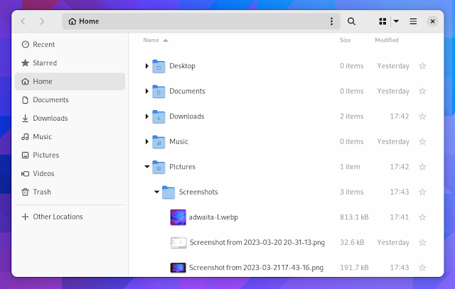
edit: people are getting confused by the fact that one is tree view, not icons view so i changed the image. old image here

goddammit
i joined dxcomplex because it was the smallest instance i was confident wouldn’t fold (and i liked the name);
then it folded so i joined .world because it was the smallest instance i was confident wouldn’t fold (and i liked the name);
then it got massive so i joined lemm.ee because it was the smallest instance i was confident wouldn’t fold (and i liked the name)
i’m starting to wonder if i’m cursed
but maybe i’m biased
yeah i’m with you there. i understand why programmes do it, a one-off purchase often isn’t enough to support continued development and server costs, but i have never bought one in my life. i actually had bought pocketcasts pro, and then they went subscription only and i immediately moved to antennapod.
topically, sync for lemmy has just released and everyone’s going wild over it. it’s a £16/year subscription. or £2/month…
@Zeus finder is single pane.
ah fair enough, i misremembered. i don’t think i’ve ever used a mac system for more than 10 minutes whilst giving friends tech support
I just don’t get how they think that’s better. 😕
i know, it’s crap. i guess at least on mac most of the users aren’t even capable of pressing f3 to open split view (not only because macs no longer have an f3); but i don’t see why nautilus has gone down that route. it seems like such an oversight. especially as it used to exist and they removed it
for some reason it doesn’t become a link like the !imaginarytrains@lemm.ee syntax does (although it does in most apps), but it does notify the recipient (the first syntax, including both @'s)