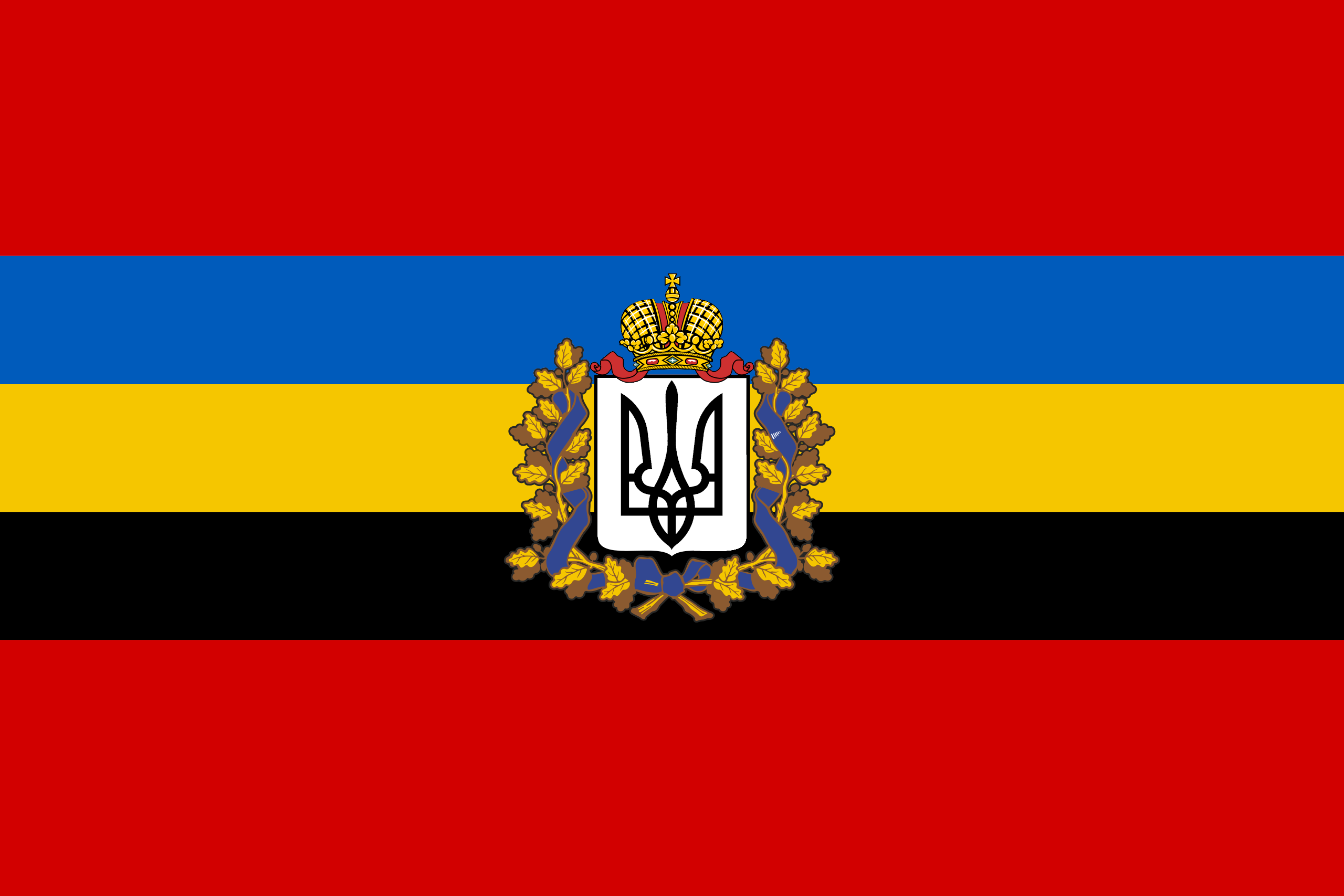
I agree. It could work if the emblem was simplified, but it’s a bit too complex right now. Not F- level though, I’d say C; the colours are unique with meaning, and the icon in the middle is striking and recognizable.
I agree. There are way too many clashing colors. It would be better if they reduced the number of colors. I could even go with reduced colors and the crest.